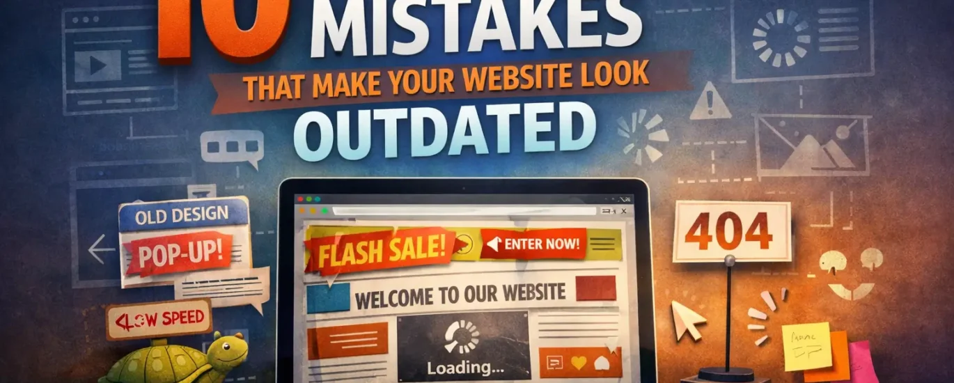
10 Web Design Mistakes That Make Your Website Look Outdated
Your website is often the first impression people have of your brand. In just a few seconds, visitors decide whether your business feels professional, trustworthy, and worth their time. A strong website can instantly build confidence. An outdated one can do the opposite.
Many business owners focus only on having a website, but not enough attention is given to whether the design actually reflects the quality of the brand behind it. A site can still function and be online, yet look old, confusing, slow, and disconnected from modern user expectations.
Good web design is not only about appearance. It also affects user experience, mobile usability, trust, engagement, and conversion rates. If your website looks outdated, visitors may leave before they even read your content or learn about your services.
In this article, we’ll break down 10 web design mistakes that make your website look outdated and explain how to fix them so your site feels modern, clean, and conversion-focused.
1. A Cluttered Homepage
One of the biggest signs of an outdated website is a homepage that tries to do too much at once.
When visitors land on your website, they should immediately understand:
who you are
what you offer
why it matters
what they should do next
A cluttered homepage usually includes too many sections, too much text, multiple competing buttons, random graphics, sliders, pop-ups, and no visual hierarchy. Instead of guiding the user, it overwhelms them.
Why it looks outdated
Older websites were often built around the idea of putting everything above the fold. Modern web design is more intentional. It values clarity, spacing, and focused messaging.
How to fix it
Create a homepage with a clear structure:
a strong headline
a short supporting description
one main call to action
clean sections with enough breathing room
visual hierarchy that helps users scan the page easily
A clean homepage feels more professional and makes your brand look more current.
2. Poor Mobile Experience
If your website is difficult to use on a phone, it already feels outdated.
Today, a large percentage of visitors browse websites on mobile devices. If your text is too small, buttons are hard to tap, images are not responsive, or sections break on smaller screens, users will leave quickly.
Why it looks outdated
Modern websites are designed with mobile usability in mind. A desktop-only mindset belongs to a much older era of web design. Users now expect websites to work seamlessly across phones, tablets, laptops, and large screens.
How to fix it
Make sure your website:
uses responsive design
has readable text on small screens
includes touch-friendly buttons
avoids oversized blocks of content
loads quickly on mobile
has menus that are easy to open and use
A modern website should feel smooth and intuitive on every device, not just on desktop.
3. Weak Typography Choices
Typography is one of the most powerful parts of web design, yet it is often overlooked.
Using outdated fonts, inconsistent text sizes, poor line spacing, or too many font styles can make your site instantly look old-fashioned. Even if the layout is decent, poor typography weakens the entire experience.
Why it looks outdated
Modern websites use typography with purpose. Clear headings, readable body text, proper spacing, and font consistency make content easier to consume and help the website feel polished.
How to fix it
Use typography strategically:
choose 1 or 2 professional fonts
create a clear heading hierarchy
keep body text easy to read
use enough spacing between lines and sections
avoid decorative or hard-to-read fonts
Good typography makes your brand feel more premium, more trustworthy, and more current.
4. Too Many Colors or Inconsistent Branding
An outdated website often suffers from visual inconsistency. You may see too many colors, mismatched button styles, different icon styles, and branding that changes from section to section.
This creates a messy experience and makes the site feel less professional.
Why it looks outdated
Modern web design focuses on strong visual systems. Brands today use consistent colors, spacing, typography, and components throughout the site. Consistency makes the interface feel intentional.
How to fix it
Build a simple and consistent visual identity:
use a limited color palette
keep button styles consistent
align your website with your brand identity
repeat design patterns throughout the site
use accent colors only where needed
A consistent design system instantly makes a website feel more modern and high-end.
5. Slow Loading Speed
Visitors expect websites to load quickly. If your website feels slow, heavy, or delayed, users may leave before they interact with your content.
Slow speed is not just a performance issue. It also affects how modern your site feels.
Why it looks outdated
Fast websites feel refined and professionally built. Slow websites often suggest poor maintenance, oversized media files, outdated code, or low-quality hosting.
How to fix it
Improve website performance by:
compressing images
reducing unnecessary scripts
removing bloated plugins
using optimized code
enabling caching
choosing better hosting
A fast website creates a better user experience and supports both SEO and conversion performance.
6. Confusing Navigation
Navigation should help users move through your website with ease. If people have to guess where to click, the design is not doing its job.
Outdated websites often have crowded menus, too many navigation items, unclear labels, or inconsistent page structures.
Why it looks outdated
Modern websites simplify navigation. They guide users with clarity and make it easy to find key pages like services, portfolio, about, contact, or pricing.
How to fix it
Improve navigation by:
keeping the menu simple
using clear page names
limiting top-level items
organizing pages logically
highlighting important actions
making navigation work smoothly on mobile
Good navigation helps users trust your website because it feels easy and familiar.
7. No Clear Call to Action
A beautiful website without a clear call to action often underperforms.
Visitors should never have to wonder what to do next. Should they contact you? Request a quote? Book a consultation? View your portfolio? Download something? If your website doesn’t guide them, it loses momentum.
Why it looks outdated
Modern websites are designed with conversion in mind. They are not just digital brochures. They are strategic tools that direct users toward action.
How to fix it
Use clear calls to action throughout your website:
place a primary CTA in the hero section
repeat it in key sections
make buttons visually distinct
use action-based text
connect each page to a goal
Examples:
Get Started
Book a Free Consultation
Request a Quote
View Our Work
Contact Us Today
A strong CTA makes your website feel more focused, effective, and professionally designed.
8. Low-Quality Images and Visuals
Blurry images, outdated stock photos, pixelated logos, or generic visuals can quickly damage the look of your website.
Visual quality says a lot about your business. Even if your service is excellent, weak visuals can make your brand feel less credible.
Why it looks outdated
Modern websites rely on clean, high-quality visuals that support the brand story. Users are more visually aware than ever, and low-quality imagery creates a poor impression immediately.
How to fix it
Upgrade your visual content by:
using high-resolution images
replacing generic stock photos with real brand visuals
optimizing image sizes for speed
keeping image styles consistent
using modern icons and graphics
The right visuals can transform the entire feel of a website and make it look current, intentional, and memorable.
9. Lack of White Space
White space is not empty space. It is one of the most important tools in modern web design.
When every section is packed tightly together, the website feels crowded, cheap, and difficult to scan. White space improves readability, focus, and overall design quality.
Why it looks outdated
Older websites often tried to fill every part of the screen. Modern websites understand that spacing creates elegance. It helps users focus on the right content and gives the interface a cleaner feel.
How to fix it
Use spacing deliberately:
add padding around sections
separate content blocks clearly
avoid cramming text next to images
create room around headings and buttons
let important elements breathe
Better spacing makes a website look more modern without changing the actual content very much.
10. Ignoring Accessibility and User Experience
A website may look visually appealing and still provide a poor experience if it ignores accessibility and usability.
Examples include:
low color contrast
tiny text
unclear buttons
missing alt text
poor keyboard navigation
forms that are hard to complete
Why it looks outdated
Modern web design is user-centered. Brands that care about accessibility create better experiences for everyone. Websites that ignore usability feel less refined and less professional.
How to fix it
Improve accessibility and UX by:
using readable font sizes
ensuring strong contrast
writing clear button labels
adding alt text to images
simplifying forms
testing the website across devices and browsers
A user-friendly website always feels more modern because it respects the visitor’s time and needs.
Why Modern Web Design Matters
A modern website does more than look good. It helps your brand communicate clearly, build trust faster, and convert more visitors into customers.
When your website feels outdated, users may assume:
your business is inactive
your services are behind the times
your brand lacks attention to detail
the user experience will be frustrating
That is why updating your website design is not just about trends. It is about perception, credibility, and business growth.
A well-designed website should feel:
clean
clear
fast
mobile-friendly
visually consistent
easy to navigate
aligned with your brand
Final Thoughts
If your website is making any of these web design mistakes, you are not alone. Many businesses hold onto websites for years without realizing how much design standards and user expectations have changed.
The good news is that even small improvements can make a big difference. Better typography, cleaner layouts, faster performance, stronger branding, and clearer calls to action can instantly make your website feel more modern and more effective.
If you want your site to build trust, support SEO, and turn more visitors into leads, your design needs to do more than just exist. It needs to work.
A modern website is not about adding more. It is about simplifying the experience, strengthening the visuals, and making every page more useful for the people visiting it.